c+h architectes
Project type: Global visual identity
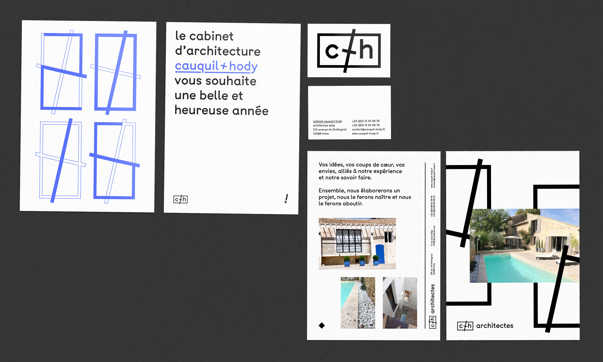
Applications: logo | stationery | webdesign
In partnership with: Benoit Hody
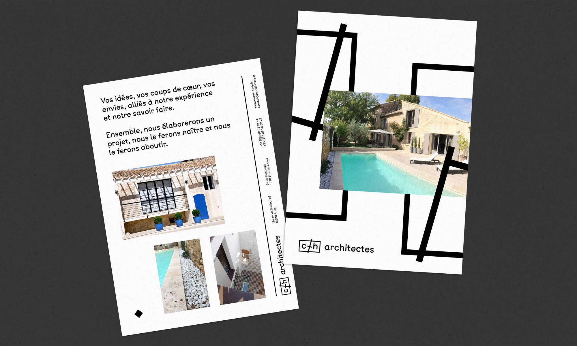
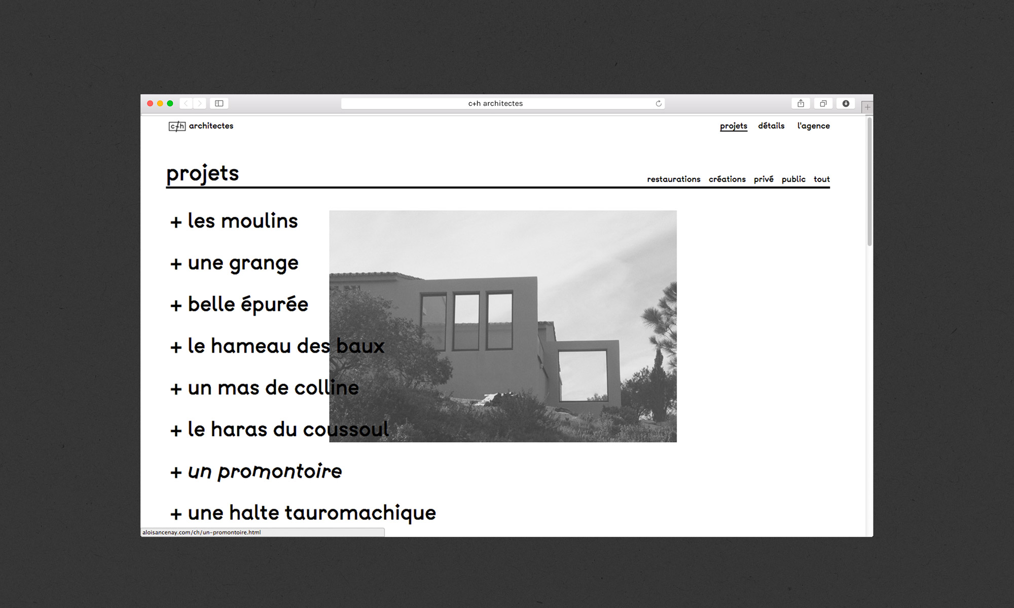
c+h is an architectural firm located in Arles. In order to highlight
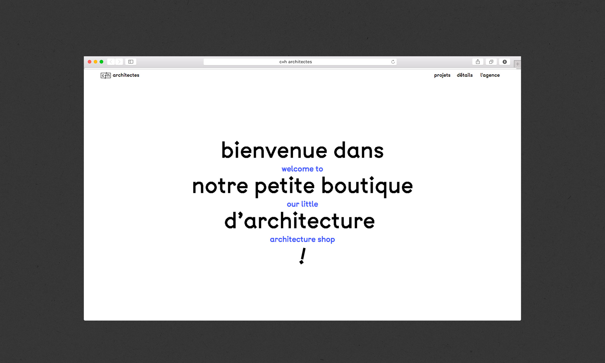
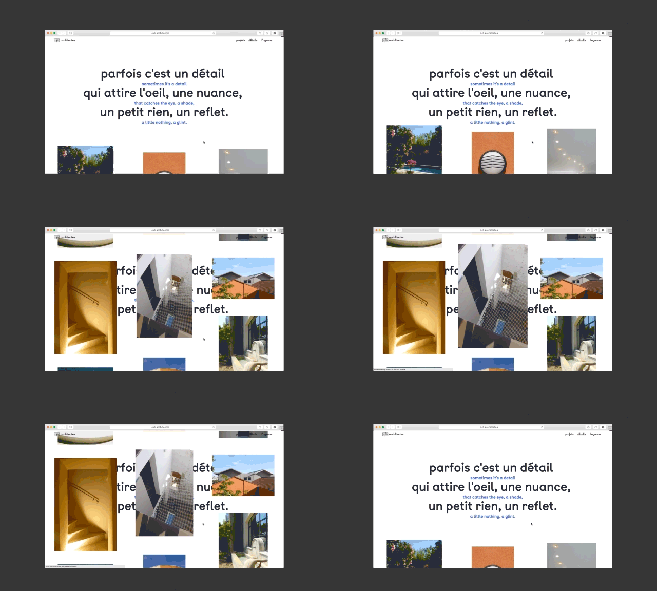
their work, the visual identity and the website has been conceived in a
most simple and effective way. The use of a unique geometric typography,
a single colour (in addition to black and white) makes it possible to
enhance the architectural visuals, colours and materials already present
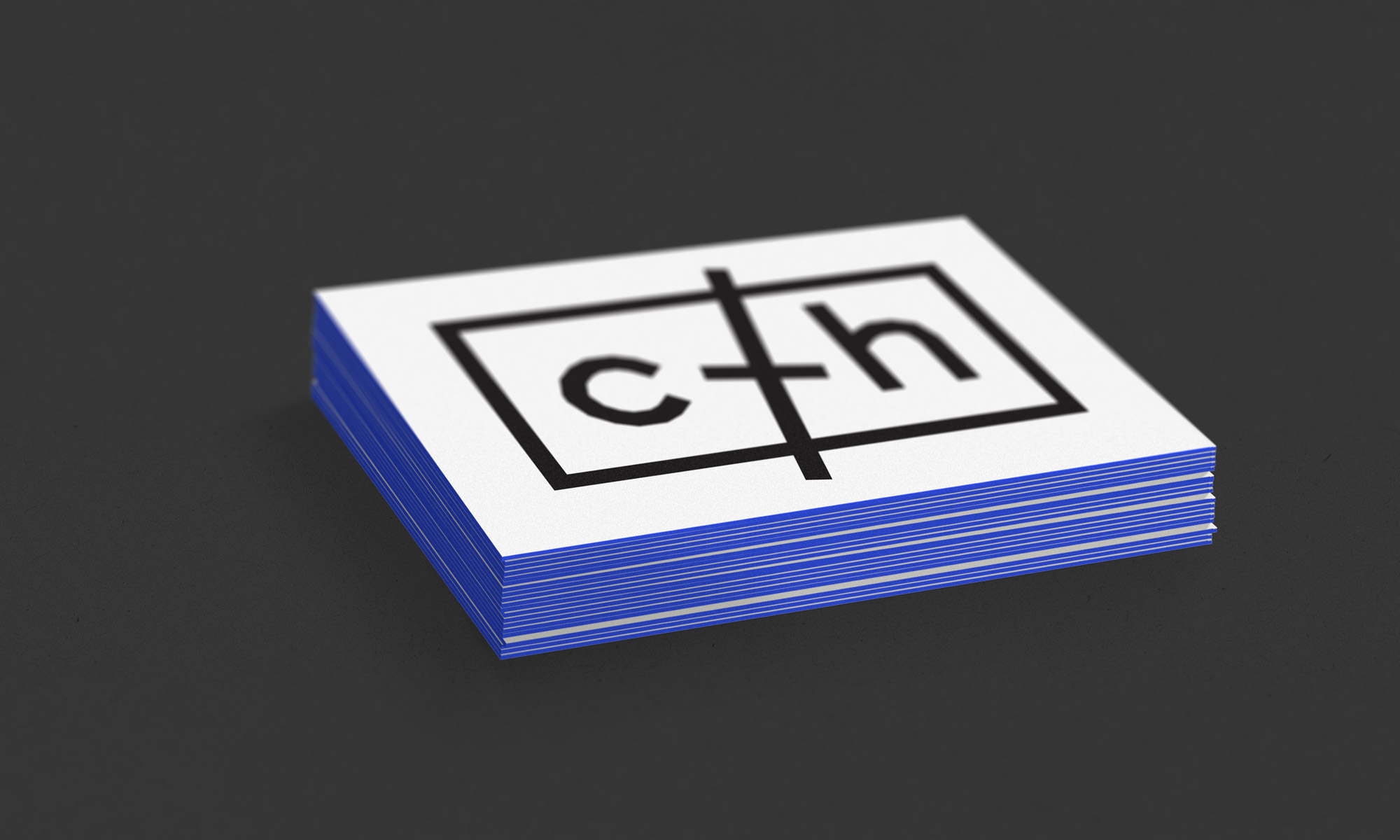
in the projects. The logo, as well as visual elements, are a reminder
of the graphic codes present in plans representations.
